web & app ui • research analytics
Virgin Wines
Enhancing the recruitment journey, and
creating a simple flow for voucher redemption.
web & app ui • research analytics
Virgin Wines
Enhancing the recruitment journey, and
creating a simple flow for voucher redemption.
The Problem
Virgin Wines' recruitment journey was long and inconsistent, with poor conversion on mobile.
Many users didn't realise they were joining Virgin Wines, or understand what WineBank offered.
Competitor analysis showed shorter, brand-led journeys converted better — so we redesigned the sign-up flow to be shorter, clearer, and mobile-first, with stronger Virgin branding throughout.
Outcomes
Cut the user flow from five screens to three, reducing friction and lifting conversion potential.
Outcomes
Simplified copy, stronger Virgin branding, and integrated social proof — boosting clarity and trust.
Outcomes
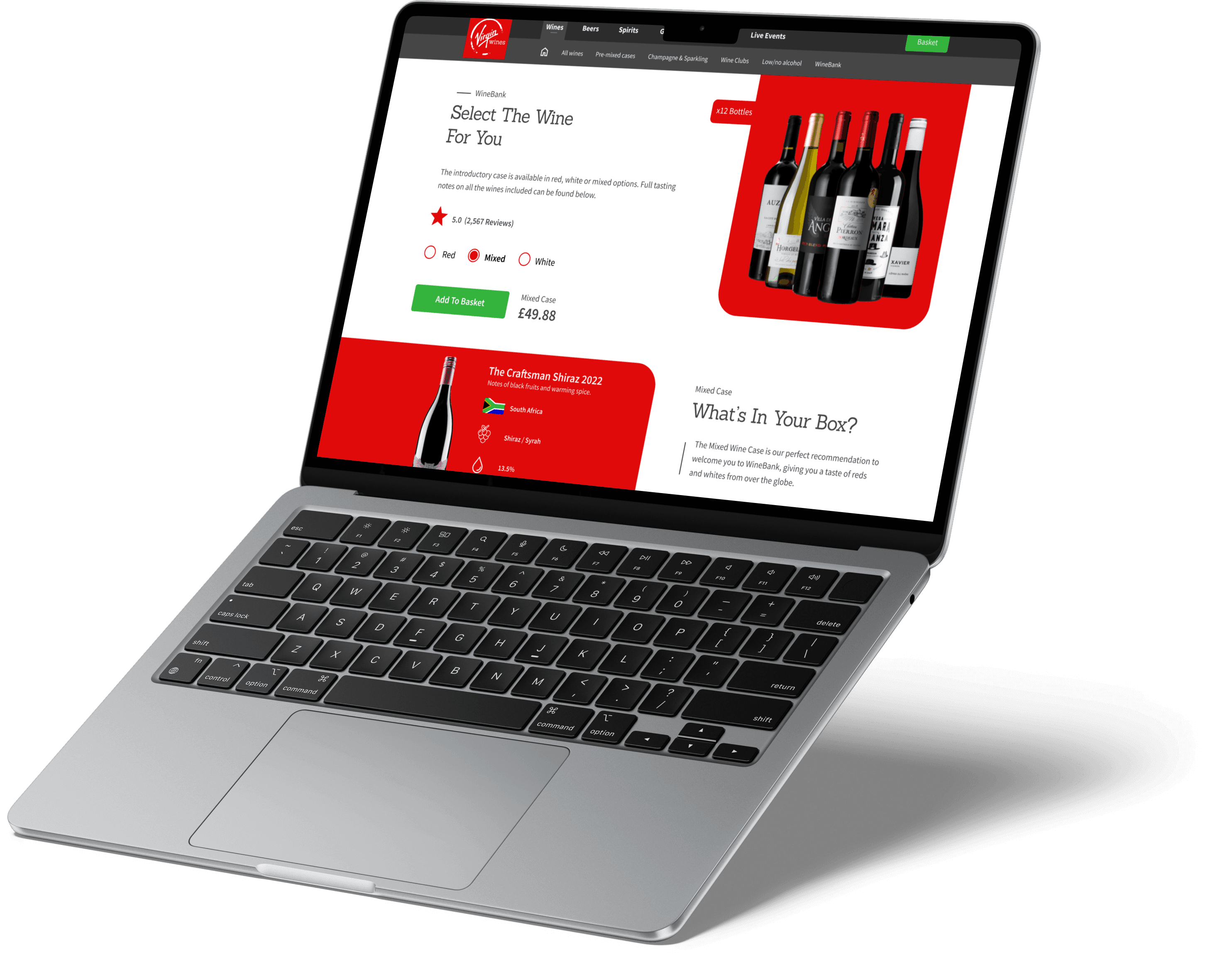
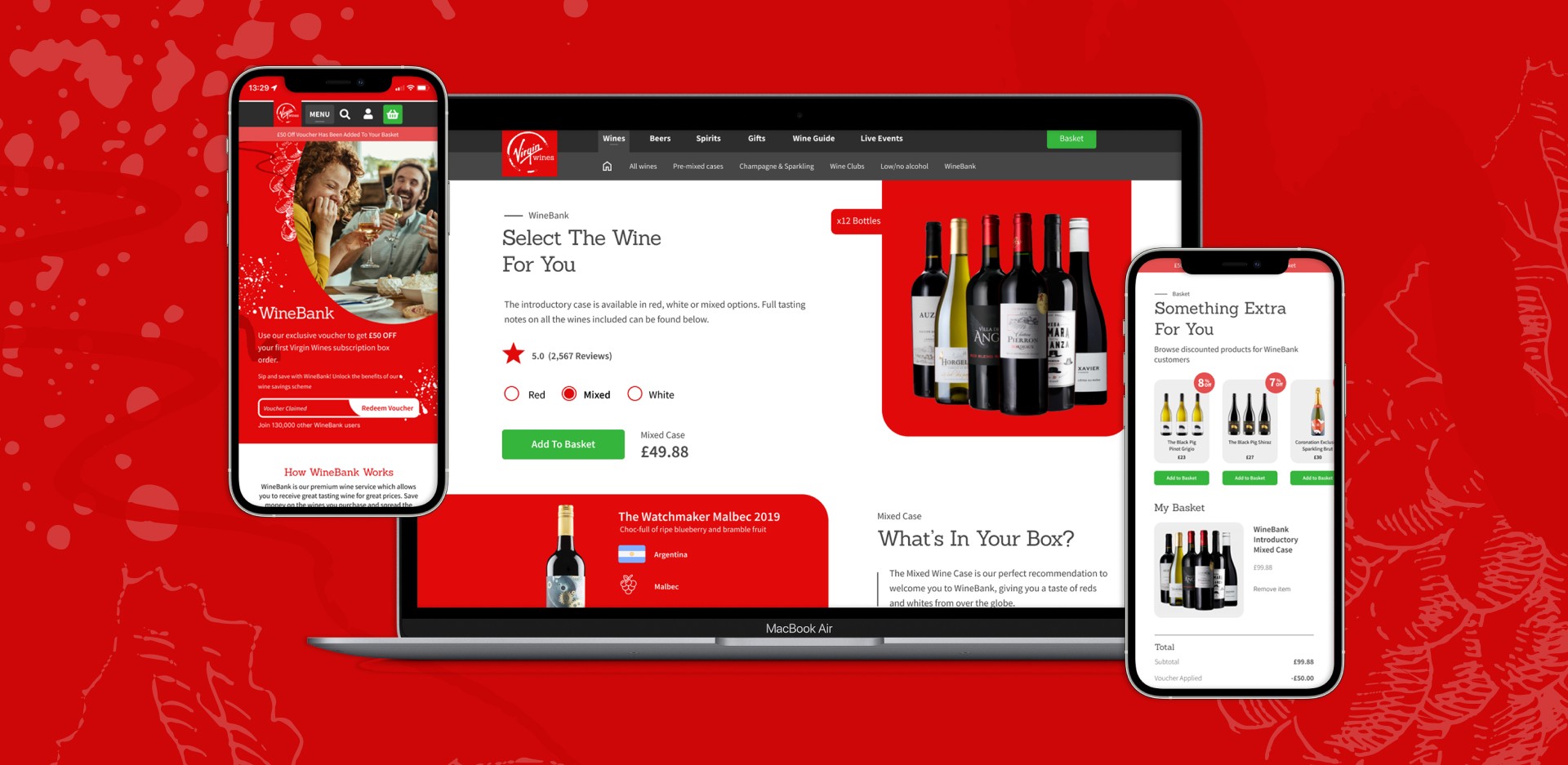
• High-fidelity desktop and mobile prototypes, backed by user testing, heuristic analysis, and competitor benchmarking.
Outcomes
Cut the user flow from five screens to three, reducing friction and lifting conversion potential.
Simplified copy, stronger Virgin branding, and integrated social proof — boosting clarity and trust.
High-fidelity desktop and mobile prototypes, backed by user testing, heuristic analysis, and competitor benchmarking.
Research
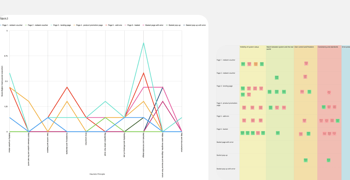
Research combined user interviews, heuristic mark-ups of the old site, and Don Norman's design principles to pinpoint pain points — then customer journey mapping traced the user's experience across each touchpoint, showing exactly where confusion and friction hit.
Copy came under the same scrutiny: using Miller's Law to assess cognitive load, we found long paragraphs and vague wording were overwhelming users, which drove the decision to reduce, restructure and merge content throughout. Competitor analysis, direct and indirect, rounded this out — user flow breakdowns and markups that fed straight into optimising conversion.
Design & Development
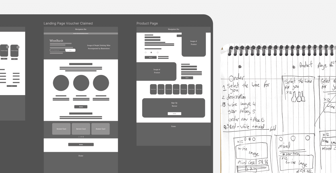
Low-fi wireframes came first, shaped by the heuristic analysis, journey mapping and competitor research — focused on cutting screens, improving hierarchy, and streamlining interactions. From there we each built individual high-fidelity concepts, merging the strongest ideas into final desktop and mobile prototypes in Figma.
We evaluated those screens against Nielsen's 10 usability principles: aesthetic and minimalist design drove further copy cuts, visibility of system status sharpened elements like discount banners. The strongest parts of each were merged into the final, streamlined prototype.
Presentation
Our final deck walked through the full process — research, heuristic analysis, competitor reviews, journey mapping — into side-by-side comparisons of old vs. redesigned pages, and closed with interactive prototypes showing the streamlined sign-up flow, built to reduce drop-off and lift conversion.
Interactive slide deck
Conclusion
Our final deck walked through the full process — research, heuristic analysis, competitor reviews, journey mapping — into side-by-side comparisons of old vs. redesigned pages, and closed with interactive prototypes showing the streamlined sign-up flow, built to reduce drop-off and lift conversion.
web & app ui • research analytics
Virgin Wines
Enhancing the recruitment journey, and
creating a simple flow for voucher redemption.
The Problem
Virgin Wines' recruitment journey was long and inconsistent, with poor conversion on mobile — many users didn't even realise they were joining Virgin Wines, or understand what WineBank offered. Competitor analysis showed shorter, brand-led journeys converted better, so we redesigned the sign-up flow to be shorter, clearer, and mobile-first, with stronger Virgin branding throughout.
Outcomes
Cut the user flow from five screens to three, reducing friction and lifting conversion potential.
Simplified copy, stronger Virgin branding, and integrated social proof — boosting clarity and trust.
High-fidelity desktop and mobile prototypes, backed by user testing, heuristic analysis, and competitor benchmarking.
Research
Research combined user interviews, heuristic mark-ups of the old site, and Don Norman's design principles to pinpoint pain points — then customer journey mapping traced the user's experience across each touchpoint, showing exactly where confusion and friction hit.
Copy came under the same scrutiny: using Miller's Law to assess cognitive load, we found long paragraphs and vague wording were overwhelming users, which drove the decision to reduce, restructure and merge content throughout. Competitor analysis, direct and indirect, rounded this out — user flow breakdowns and markups that fed straight into optimising conversion.
Design & Development
Low-fi wireframes came first, shaped by the heuristic analysis, journey mapping and competitor research — focused on cutting screens, improving hierarchy, and streamlining interactions. From there we each built individual high-fidelity concepts, merging the strongest ideas into final desktop and mobile prototypes in Figma.
We evaluated those screens against Nielsen's 10 usability principles: aesthetic and minimalist design drove further copy cuts, visibility of system status sharpened elements like discount banners. The strongest parts of each were merged into the final, streamlined prototype.
Presentation
Our final deck walked through the full process — research, heuristic analysis, competitor reviews, journey mapping — into side-by-side comparisons of old vs. redesigned pages, and closed with interactive prototypes showing the streamlined sign-up flow, built to reduce drop-off and lift conversion.
Interactive slide deck
Conclusion
Our final deck walked through the full process — research, heuristic analysis, competitor reviews, journey mapping — into side-by-side comparisons of old vs. redesigned pages, and closed with interactive prototypes showing the streamlined sign-up flow, built to reduce drop-off and lift conversion.